Task Velocity: Your Productivity Pulse
Most productivity tools tell you what you did. Task Velocity tells you whether you're keeping up. It's a single number — a multiplier — that reflects the ratio of tasks you've completed to tasks you've added over the past 30 days, shown in a few places across the app with different levels of detail depending on your plan.
What Task Velocity Measures
Task Velocity is the ratio of tasks you've completed to tasks you've created over the past 30 days. It's expressed as a multiplier — for example, 1.2x or 0.8x. If you completed 12 tasks and created 10, your velocity is 1.2x. If you completed 8 tasks and created 10, it's 0.8x. The window is always a rolling 30 days, so the score updates continuously as you work.
How to Read Your Score
| Score | Label |
|---|---|
| < 0.8x | Low velocity — backlog increasing |
| 0.8–0.99x | Moderate pace — slight backlog growth |
| 1.0–1.19x | Good pace — staying on top of tasks |
| ≥ 1.2x | Excellent momentum — completing more than creating |
| No data | — |
None of these labels are a grade. A Low reading during a heavy planning sprint is normal. A Low reading sustained for weeks is worth a look. The tiers exist to save you from interpreting the raw number yourself — not to tell you whether you're doing well.
Where You'll See It
Your current score is always visible, on every plan:
- On mobile, it's the Velocity tile on the Home screen.
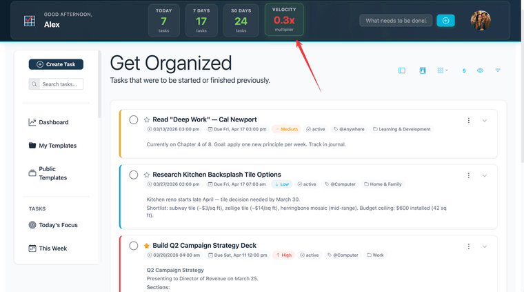
- On web, it's the Velocity card in the header, shown on every page.
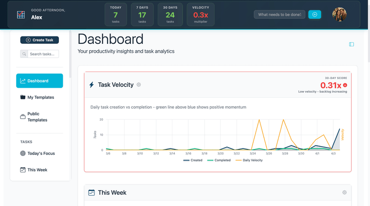
Task Velocity also appears in the Dashboard's Task Velocity panel — but that panel is premium, and free users don't see a score there at all, just a description and an upgrade prompt. See Free vs. Premium Access below for what premium adds.
Free vs. Premium Access
Premium feature. The Task Velocity chart and its filters, on the Dashboard, require a paid plan. Free users see a description and an upgrade prompt in place of the chart — not a score.
Premium unlocks a historical chart showing how your score has moved across past 30-day windows. On mobile, tap the score card to expand the chart. On web, the chart is already visible once you're on a paid plan.
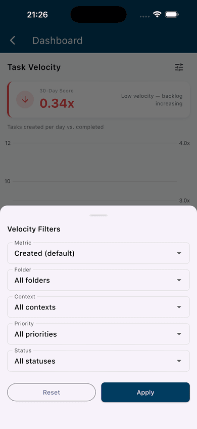
To refine the chart, use the filter controls from the gear icon: Metric (Tasks Created, or Outstanding Tasks — a slower calculation that shows backlog size instead of daily creation, flagged with a latency warning in the filter sheet), Folder, Context, Priority, and Status. Filtering isolates velocity for a specific slice of your work — for example, filtering by a single folder shows whether that folder alone is driving the overall score up or down.

Improving Your Task Velocity
The most direct way to improve velocity is to make completion easier — which usually means reducing friction, not working harder. A few behaviors that tend to help:
Keep tasks small. Large, vague tasks tend to stall. A task titled "Redesign the homepage" might sit for weeks, while "Draft homepage copy" gets done in an afternoon. Break work down until each task represents a single, doable action. See Break Any Project Down with Subtasks for how to structure this.
Use due dates consistently. Tasks without dates are easy to defer indefinitely. When tasks have dates, they surface in Today's Focus and This Week, which makes them visible and harder to ignore.
Clear your completed list regularly. Tasks that are done but not marked complete still count against your velocity calculation. Complete tasks when you finish them.
Audit old tasks. If your list has tasks that are months old and still open, decide: complete them, break them into something actionable, or delete them. Tasks that will never be completed are noise, and they pull your score down every 30 days they remain open.
For a deeper read on what your score is actually telling you and how to act on it, see What Your Task Velocity Is Really Telling You.