Using the Dashboard to Understand Your Work
A report tells you what happened. The Dashboard tells you what your work actually looks like over time — and once you can see the shape of it, you can start making deliberate choices about it. This is for people who already know their way around the Dashboard and want to use it as a diagnostic, not just a status page.
Reading System Health as Triage
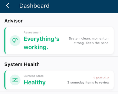
On mobile, Daily Briefing already does some of this reading for you — one sentence, built from System Health, Task Velocity, and this week's balance, meant for the days you just want the headline. Everything below is for when you want to know why.
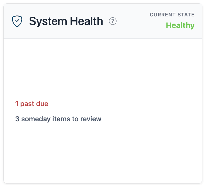
System Health's verdict is a triage tool, not a grade. It only counts active work — someday items, anything on hold or postponed, don't factor into the ratio at all, so parking something on purpose won't move the needle, but leaving an active problem sitting there will. A Strained verdict with three of the four signals lit up almost always traces back to one thing left unresolved too long, not four unrelated problems. Pull the oldest one and the rest often clear with it.
On web, each signal is a door into the filtered list behind it — that's the loop worth building into a weekly check-in: read the verdict, open whichever signal looks worst, and actually look at what's there. On mobile, System Health won't take you anywhere when you tap it. That's by design — it's a fast pulse-check, not a launch point. If something's flagged, go find it in your task list yourself.
When Health and Velocity Disagree
The two don't have to agree, and when they don't, that disagreement is often the most useful read you'll get all week.
A Strained verdict next to a strong velocity score — 1.3x, say — means you're not out of the woods, but you're moving the right direction. Worth noting, not worth panicking over. A Healthy verdict next to a weak score, 0.6x, is the quieter warning: nothing's flagged yet, but the list is quietly growing, and it just hasn't crossed the threshold that would make System Health say something.
Neither pairing is a contradiction. Health is where you stand right now. Velocity is which way you're headed. A system can be a mess and still be improving fast, or tidy and still slipping. See Task Velocity: Your Productivity Pulse for how the score itself is built.
Spotting Patterns in the Heatmap
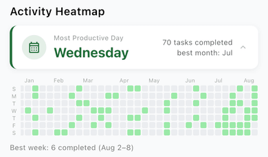
This one's premium on both platforms, though only web lets you tap a day to see what you finished — see Your Work at a Glance for the full breakdown of what's different where.
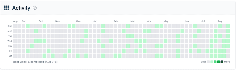
A single dark square in the grid doesn't mean much on its own. The shape across a season does.
This Week shows you one week. The Heatmap shows you fifty of them, stacked. If one row across the whole grid stays consistently lighter than the rest, that's not a bad week — it's a structural fact about how your week is shaped, and probably worth planning around rather than fighting.
The best-week caption is more useful as a description than a target. Rather than trying to reproduce that exact week, it's worth asking what was different about it — a lighter meeting load, a specific kind of work, a deadline that forced clarity. That's usually more repeatable than the raw number.
This Week: Reading the Balance
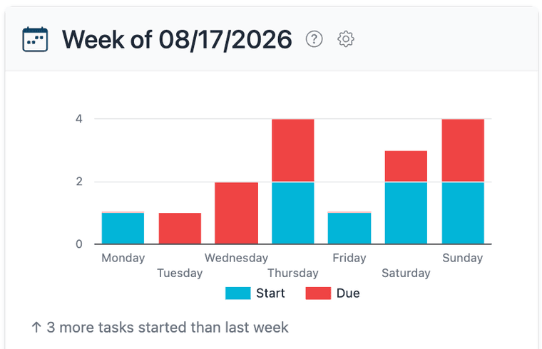
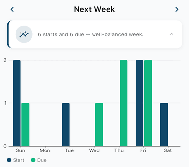
This Week measures something different from Velocity — not what you've finished, but what's scheduled to start or land. A week that's mostly Due with few Starts usually isn't a signal about this week at all. It's the echo of due dates set weeks ago, all landing at once.
On web, the comparison line checks this week against last week — useful for catching a week that's genuinely heavier than normal, not just heavier than it feels. On mobile, the comparison is internal: this week's starts against this week's dues, which is a good read on whether the week ahead is front-loaded or back-loaded, but won't tell you if the whole month is trending up.
Where Folders Point You
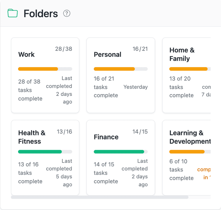
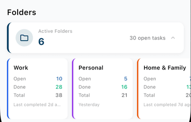
A folder's progress bar and its recency flag tell you different things, and reading them together is what makes the panel useful. A low completion percentage with a recent finish is a folder that's actively being worked — it's just large. A low percentage with an old "last completed" date is a folder that's stalled, and worth a look.
On mobile, Folder Summary skips the percentage and shows Open, Done, and Total instead. Do the same math by eye, and lean harder on the recency flag — it's the more direct signal either way.
What the Dashboard Does Not Show
The Dashboard measures volume and status — task counts, completion timing, how long something's been sitting. It doesn't measure whether the work mattered.
A week with thirty completions and a week with five can both be good weeks, or both be wasted ones, depending on what was in those tasks. A high velocity score built on clearing low-priority items while one real priority stalls isn't the picture of productivity it looks like — and neither System Health nor Velocity will catch that on their own, because neither one knows what a task is worth to you.
The honest use of the Dashboard pairs the numbers with a gut check: were the tasks finished this week the ones that actually mattered? If yes, the Dashboard is confirming something good. If no, it's providing cover for something that deserves attention.
Turning Observations into Changes
A Dashboard observation is only useful if it leads somewhere. A few patterns tend to.
One weekday is consistently light in the Heatmap. If a day almost never shows completions, across weeks and months, that's information about how the week actually runs versus how you think it runs. It might be legitimately consumed by something else. It might be a better fit for review or planning than for closing tasks.
Velocity drops while task creation climbs. This is inbox inflation — capture outpacing processing. It's not a reason to capture less. It's a cue for a review pass to assign, break down, or drop what's aging into noise before it does. See Building a System That Actually Works for the review structure that handles this.
One folder's card looks strong; another looks stalled. The Folders panel is usually the faster first read — a stalled card with an old completion date is easy to spot before going looking for a cause. From there, filtering Task Velocity by that folder shows whether it's genuinely blocked, no longer relevant, or just quietly deprioritized. Each answer points to a different fix.