Your Work at a Glance
The Dashboard shows you two things: System Health, a snapshot of how much of your current workload is a problem, and Task Velocity, a 30-day trend of whether you're completing work faster than you're adding it. Beyond those two, the Dashboard adds an activity heatmap, a look at the week ahead, and a breakdown of your folders. Most of this works the same on web and mobile — the differences are called out below.
Opening the Dashboard
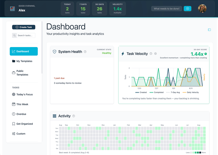
On web, click Dashboard in the sidebar. It's the first item in the navigation.
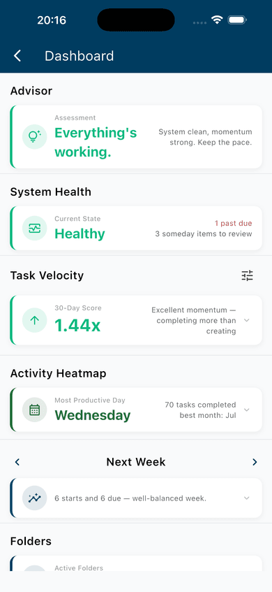
On mobile, open the drawer and tap Dashboard.
Reading the Dashboard
On web, the Dashboard is a single scrolling page. On mobile, it's a single scrolling screen too, with mostly the same sections — see the callouts below for what's different.
Daily Briefing — one sentence that reads System Health, Task Velocity, and this week's balance of starting vs. due tasks together, and tells you the shape of things at a glance. On mobile only — this sits at the top of the screen. Web doesn't have it.
System Health — a single-word verdict (Healthy, Strained, or Overloaded) based on the share of your active work that's actually a problem, plus up to four signals: past due, no next action (a folder with open tasks but nothing marked as the next concrete step), waiting on others, and someday items due for review. On web, each signal is clickable and takes you to the filtered list behind it. On mobile: the signals are informational only — tapping one doesn't do anything.
Task Velocity — your current 30-day score, a tier label (Low, Moderate, Good, or Excellent), and a historical chart you can filter by folder, context, priority, status, and metric. Premium only — see Free vs. Premium Access below. On mobile: it's a card you tap to expand into the chart, rather than something always in view.
Activity Heatmap — a year of daily completions in a GitHub-style grid; darker squares mean more finished that day. Premium only. On web, click any day to see what you completed. On mobile: the grid looks the same, but tapping a day doesn't do anything.
This Week — two columns per day, tasks starting and tasks due, so you can see whether the week ahead is front-loaded with new work or backed up with deadlines. On web, the gear icon lets you jump to a different week, switch from counting tasks to counting scheduled minutes, and filter to complete or incomplete only; a line below the chart compares this week's starts to last week's. On mobile: there's no gear menu, just arrows to move a week forward or back, and the comparison line reads this week's starts against this week's dues instead of last week's.
Folders (called Folder Summary on mobile) — a card for every folder with at least one open task: a completion fraction, a progress bar, and how recently you finished something there. Two weeks or more without a completion gets a warning flag. On mobile: cards scroll horizontally and show an open/done/total count instead of a progress bar.
Context and Priority/Status — sortable tables of your open task counts, collapsed by default, expanding when you tap the header. Click any row to see that slice of your list. Web only — these aren't part of mobile's Dashboard.
What the Numbers Mean
System Health is a snapshot, not a trend — it tells you how much of your current workload is a problem, right now. Under 15% of your active tasks flagged is Healthy. 15–40% is Strained. 40% or more is Overloaded.
Task Velocity is a trend, not a snapshot — the ratio of tasks completed to tasks created over the last 30 days. A score above 1.0x means you're clearing work faster than you're adding it. Below 1.0x, your backlog is growing. See Task Velocity: Your Productivity Pulse for the full breakdown, including what each tier means.
These two numbers won't always agree, and that's normal. A Strained system can still have excellent velocity — you're actively digging out. A Healthy system can have low velocity — organized, but not moving much either direction.
This Week shows whether the days ahead are front-loaded with new work or backed up with deadlines.
Folders shows which parts of your work are moving and which have gone quiet. A folder with a low completion fraction and an old "last completed" date is where attention is most needed.
Free vs. Premium Access
Premium feature. The Task Velocity chart and the Activity Heatmap require a paid plan, on both web and mobile. Free users see a description and an upgrade prompt for each — no score, no grid. System Health, This Week, and Folders (Folder Summary on mobile) are available on every plan.
Your current Task Velocity score is never gated. It's just not shown on the Dashboard for free users — you'll always find it on the Home screen's Velocity tile (mobile) or the Velocity header card shown on every page (web). See Start Every Day with Focus.
Using the Dashboard Regularly
The Dashboard works best as a standing check-in, not something you watch throughout the day. Once a week, read System Health first — or Daily Briefing on mobile, which is built to be the fastest read. If the verdict or a signal surprises you, that's the useful part: follow it into the filtered list and see what's actually going on. For a deeper walkthrough of what to do with what you find, see Using the Dashboard to Understand Your Work.